Pale pink, blue are red hot

By Carleton Varney
Special to the Daily News
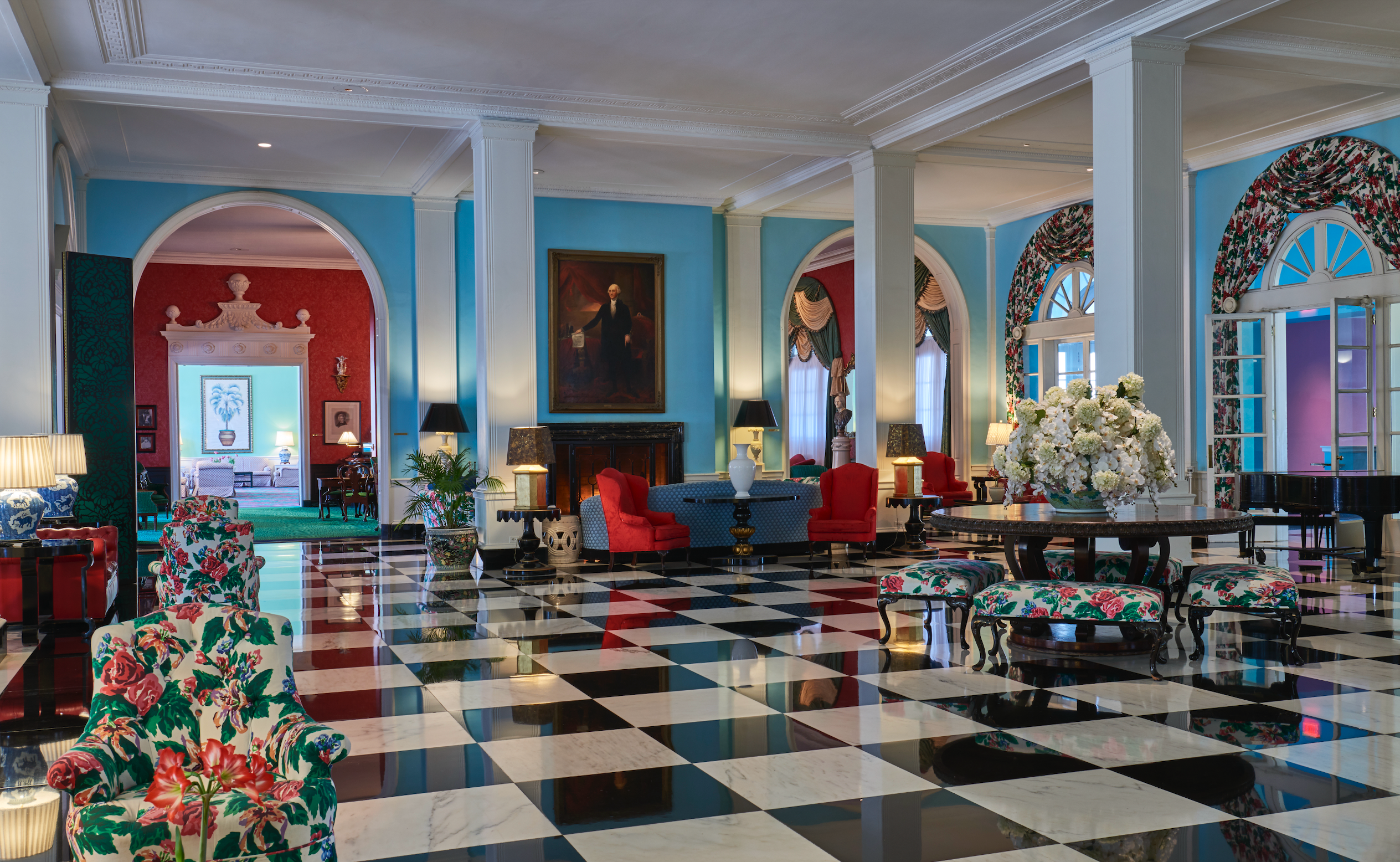
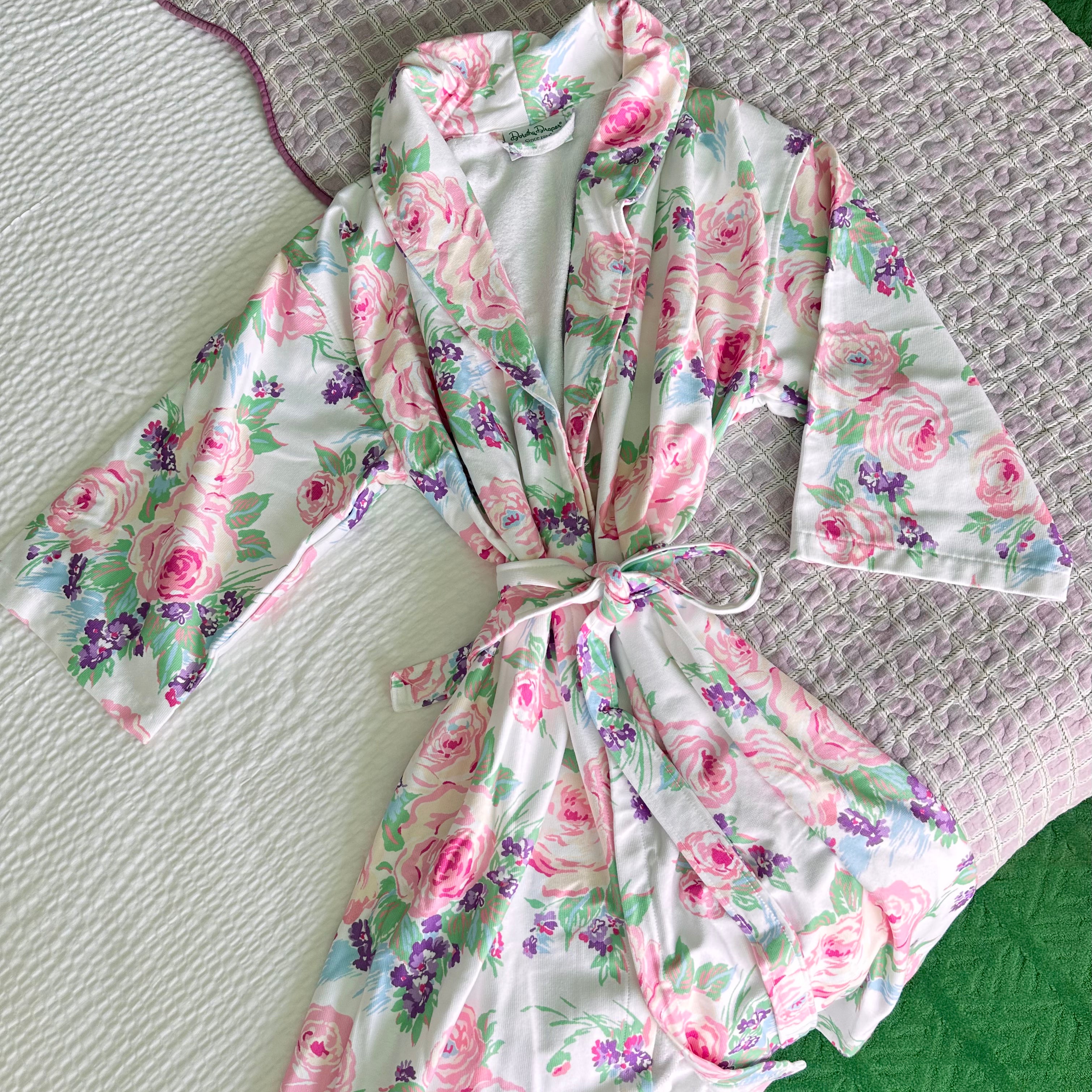
Well, folks, this year we shall be coloring ourselves and our homes in Serenity and Rose Quartz. These two colors speak to my love of travel — particularly a visit to the sunny shores of Bermuda, where these shades of blue and pink color the landscape.


The Wall Street Journal heralded the arrival of Pantone’s rose and blue with a page filled with men’s shirts, ties, ladies’ gowns, dresses, handbags, jewelry, home furnishings and accessories, glassware, tabletop decorations and kitchen utensils, including a old-fashioned mixer.
I am a great fan of both colors. They are to me staples in the design and decorating world, because I consider them neutrals.
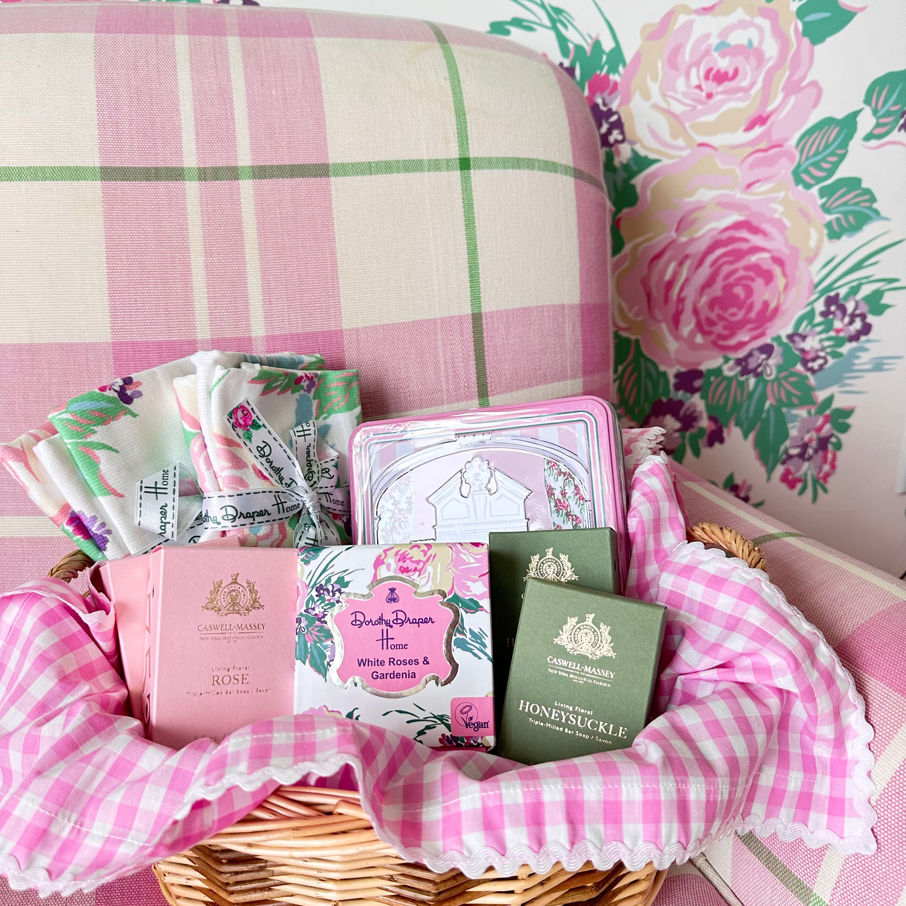
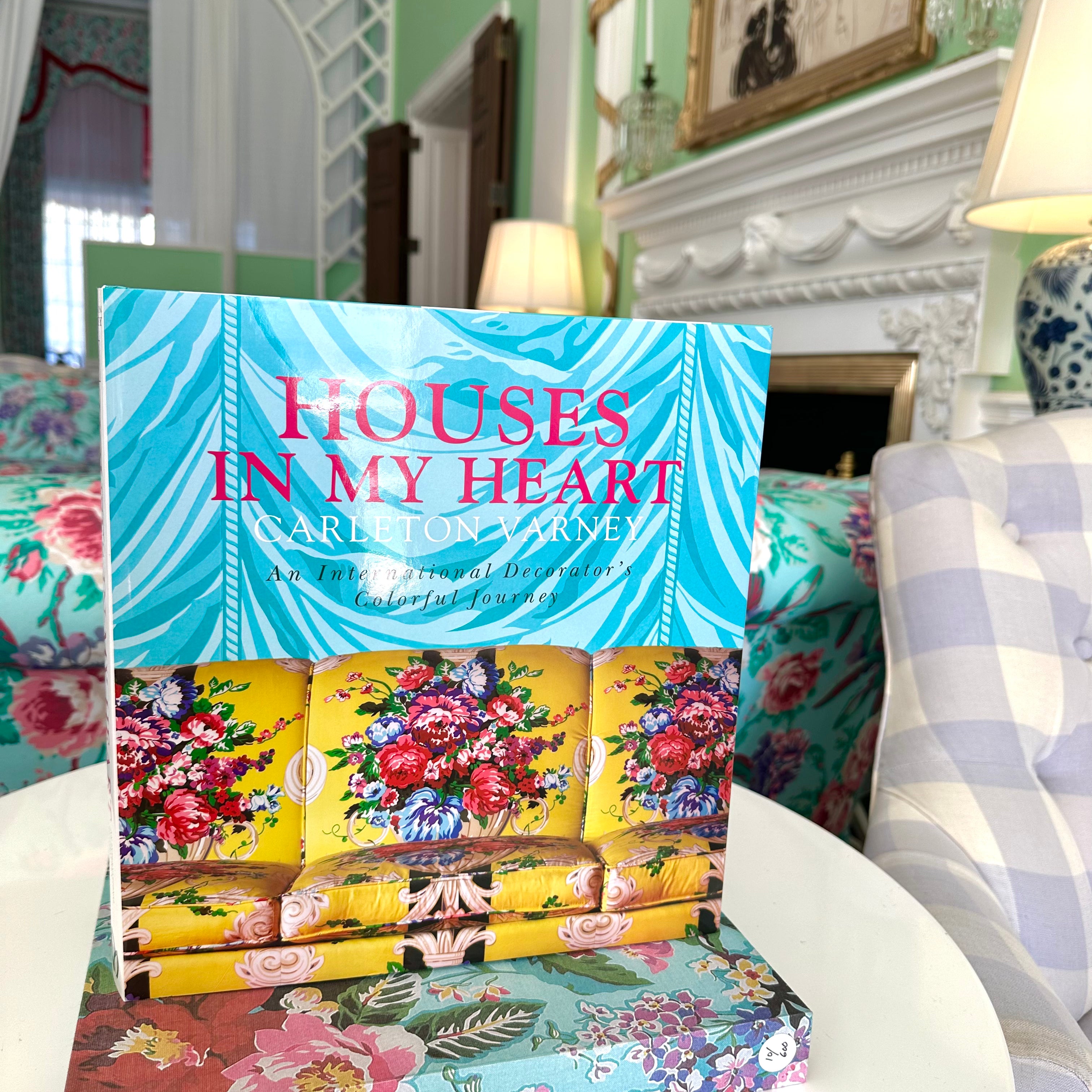
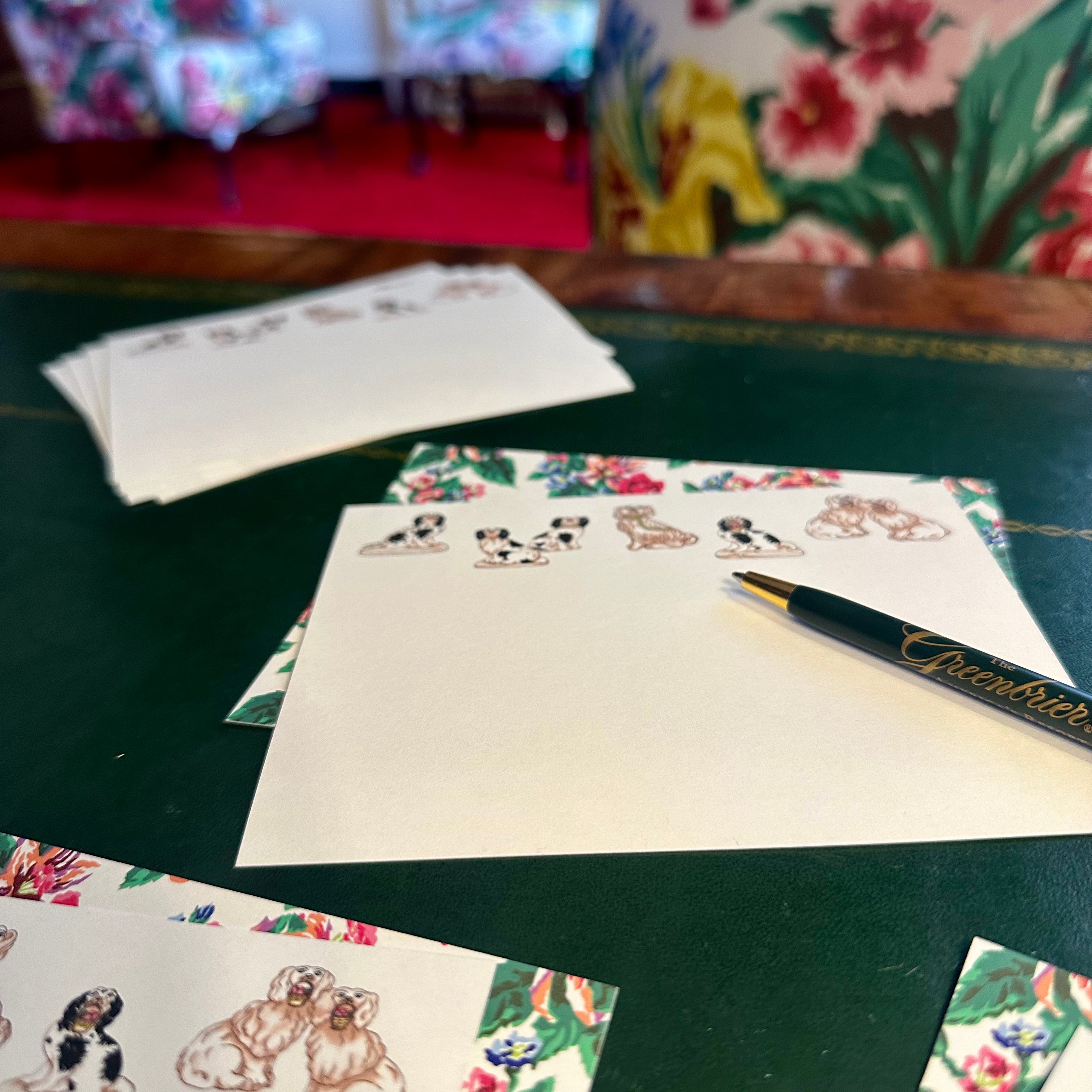
Paint a drawing room pale quartz pink — maybe using Fine Paints of Europe’s great new pearlized paint right out of the pot — and you’ve got the beginning of a super Palm Beach decorating palette. Paint all trim white, and for the ceiling use Pantone’s Serenity, a peaceful blue. For your draperies, choose a lovely print of pinks, blues and soft leaf greens on a crisp white background. Top the drapery with valances fashioned from a cotton check in quartz pink and white. The checks with the flowery print will be happy together.
For upholstery on your sofas, go for a crisp white linen, and pipe the cushions with pale blue. Lounge chairs can be covered in the same check as the window valances. For the color of your carpeting, or if you prefer a rug, I’d prefer a pale lawn green or a great rich cream. Or if you are going by the Pantone twins, choose a carpet of Serenity bordered in Quartz Rose.
I would love such a room in pinks and soft blues. Thanks to Pantone’s selection for the new year, the world is likely to look a bit happier, brighter and rosier. Leatrice Eiseman, who directs the Pantone Color Institute, gets my personal bravo for analyzing how we live and dress. And after some serious consideration, I’ve no doubt, choosing to celebrate Serenity and Rose Quartz.
Both colors to me are very gender friendly. I have never thought much of the idea of choosing pink for girls and blue for boys. All colors pass the gender line today. Recently I completed a man’s library where the walls were paneled in rich walnut, complemented by a plaid carpet of chocolate brown, pink, beige, green and black. And his drapery was a rich, dense pink trimmed in rich chocolate.
Hooray! I’m in the pink — and in the blue!
0 comments

